Her tells the quiet, beautiful story of the unlikely relationship that develops between a lonely writer and his interactive operating system. The costumes place us in a not so distant future through subtle use of minimalism, shape and color. Costume designer Casey Storm does an incredible job supporting the story and then getting out of the way. Already nominated for a 2014 Costume Designers Guild Award for Excellence in Contemporary Film, I recently had the chance to ask Casey about his work on Her.
Tyranny of Style: You’ve collaborated with Spike Jonze on many projects, can you tell us a little about that working relationship and what it is like to work on a project with someone you have that kind of familiarity with?
Casey Storm: “I love working with Spike. We are friends first and co-workers second. And, it’s not just with Spike. The film family that we have includes KK [Barrett, Production Designer], and Eric [Zumbrunnen, Editor] and a whole group of people that have all been together for years and years. The process with all of us is different than with most other projects in that we are a real team. We all bounce ideas off of each other and everyone bleeds out of their department so that the process is truly collaborative.”
T/S: Can you talk a little bit about your overall inspiration for the film?
CS: “The world that we created in her is the result of a lot of conversations over a long period of time. Initially we had theoretical brainstorming sessions with a bunch of us in a room just talking about ideas and feelings. What sort of emotion did we want to convey? What elements of today did we want to extend into the future. We then talked about the idea of classic “future” elements like silver and cold materials and technology and realized at some point that we were better served by going the other direction. In the future, one has access to everything. Why wouldn’t we create a world that is warm and cozy and soothing? Why wouldn’t we gravitate towards colors and fabrics and textures that made us feel comfortable and loved? Eventually we used these ideas and the concept of a bespoke environment to inform the clothing. We went backwards in time rather than forwards for influence, mixing different garments from different eras. I knew i wanted silhouettes to be slightly different than contemporary silhouettes, but the goal was to not be distracting. I wanted the viewer to always be aware that they weren’t in today’s world, but to rarely being attention to why.”
T/S: I really appreciated your use of color- not the drab colors of the future we are used to seeing. Everything had a wonderfully cohesive tinted quality. How would you describe your overall color palette? What was your inspiration and meaning in it?
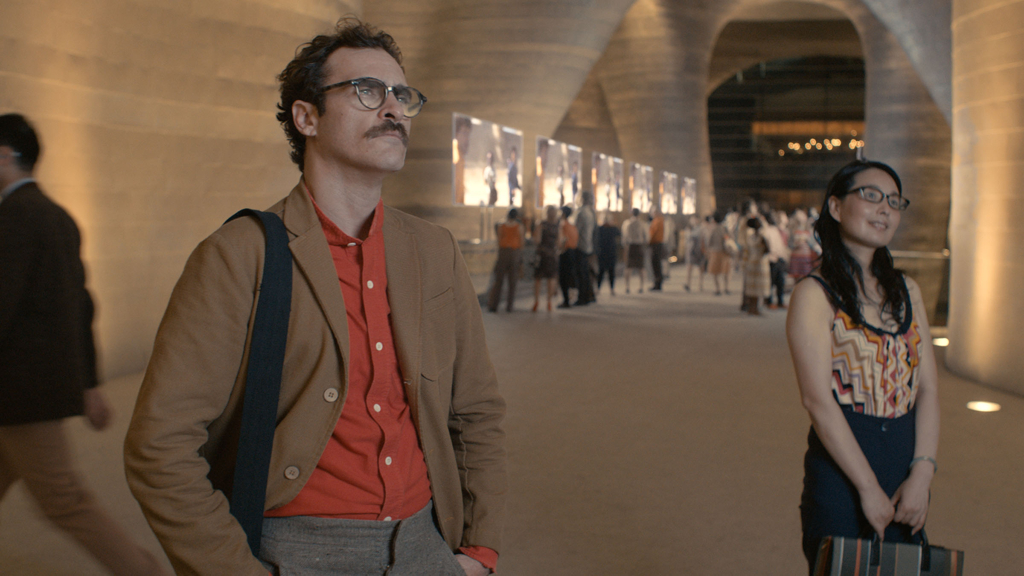
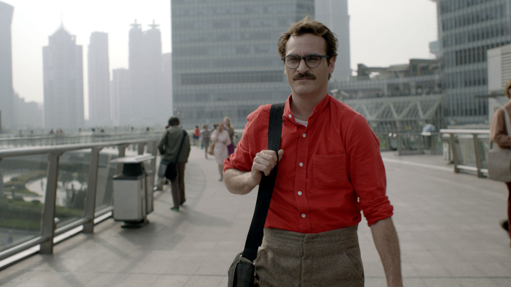
CS: “The blue/silver/black/white palette that films use to represent the future didn’t feel right to us. That wasn’t the story we were telling. The emotion that we were conveying drove all decisions about color. The red shirt that Joaquin wears s actually my personal shirt. I wore it one day to the office and Spike liked it. We tried it on Joaquin and found out quickly that we could put him in bright happy colors without him feeling those emotions. He’s so amazing at playing something internally and that helps balance whatever choices I made. He can pull off most anything.”
T/S: Can you describe your inspiration behind the world of prints you utilized in the film?
CS: “I think I saw print as a subtle way to draw the future in. Since I wasn’t playing with futuristic textiles and I wasn’t utilizing a futuristic palette, I felt like I could be a little liberal with the prints. I tried to use geometric patterns and shapes to just make things interesting and to make it clear that it’s easy to be yourself in the future. It’s easy to express who you are because you have access to everything. Joaquin is in mostly solids, so I put a lot of the background in prints to give him an exciting canvas to play off of.”

T/S: I’m fascinated by your referential use of elements- from 19th century high waisted peg pants to1930s/70s patch pocket coats. Can you tell us a little about these references, why you were drawn to them, and what they mean in the world of Her?
CS: “Spike told me early on that he chose the name Theodore for Joaquin because he was thinking of Theodore Roosevelt. I think that was the initial impetus for sending me searching in the period wardrobe sections of the costume houses. High waistlines and slim fit legs and other style decisions started to fall in place one after another after we began going this way. I guess the general idea is that if we continue to parlay the idea of bespoke clothing, you can take a little bit of every decade that you like and create a mish-mosh style. Waists from the 30s, slim fits of the 60s, colors of the 70s, etc.”
T/S: The costumes overall appear on screen as all natural fibers- predominately cotton with some wool and silk. Can you speak to the inspiration and meaning behind this element?
CS: “That’s true. It goes back to what I talked about earlier with creating a world of comfort. That’s one part. The second part is looking at what’s happening now. There is such a big push towards eco and towards recycling. This lends itself to the idea that the materials of the past should be used again in the future. We wouldn’t be creating new materials, we would just be reusing old materials.”
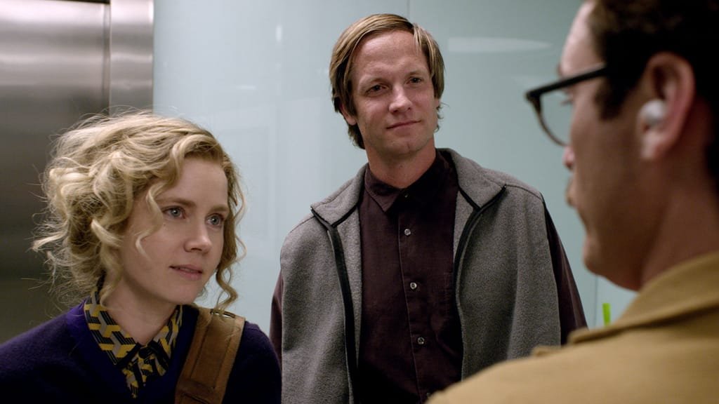
T/S: The only time I noticed you stray from this formula was a scene in which Charles wears a fleece vest- was this just the right piece, or was there meaning to this material selection?
CS: “Charles is the exception to this rule. I think this was just because i wanted that character to have some older tech elements that would set him apart a little. KK definitely hated me using fleece on Charles because we had set up strong rules against tech, but it just worked so well on him that I couldn’t help myself.”
T/S: I really enjoyed that you built a limited/more believable closet for Theodore (Joaquin Phoenix). What was your inspiration/meaning behind that?
CS: “I try to do that whenever I can unless the character calls for something different. Maybe it’s because I come from the advertising world where you usually only get one outfit to define a character, but I am attracted to simplifying things. I want to know that guy inside and out and I don’t need a bunch of looks to tell that story, I just need to get the few stories that I do tell right. Always quality over quantity.”
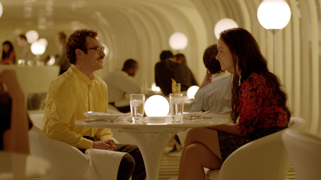
T/S: I’m interested in Theodore’s color story. You make use of a wonderful mix of pops of color when he is in public, but predominantly white when he is at home/in-bed. Can you describe the meaning and inspiration behind this?
CS: “I focused on shapes for a long time and colors second. I like color in his world when he is interacting, but when he was at home, in bed, I found that white or navy worked better. It does contribute to a vulnerability. The truth is actually probably a lot simpler though, it just looked good. The white t-shirt and boxers against white sheets and pillows just created a beautiful portrait.”
T/S: Can you tell us about the inspiration for Amy’s (Amy Adams) costumes?
CS: “Amy was an opportunity to be a little more playful. We wanted her to feel comfortable in her own skin. She wasn’t trying to impress anybody, but she did have a good sense of style. I find her looks pretty cool and she fits appropriately into the world that she lives in, being a documentary filmmaker.”
Thank you to Casey for his participation. Catch this incredible film in theaters!